
The Best Bold Interior Paint Colors, According to Designers
Are you ready to take a step away from safe, neutral paint colors? We asked four Scouted interior designers for the intrepid hues they’re gravitating toward that deliver the wow factor while having some serious staying power. Read on to get inspired and prepare to make a splash with bright, deep, and saturated shades. Need to call in the pros for a consult? We’ve got you. To find a Scouted design expert near you, check out The Scout Guide Directory.
 Interior design by Glickman Studio. Photography by Robert Radifera.
Jennifer Glickman, principal and owner of Glickman Design Studio in Charlottesville, Virginia
Ballet Slippers by Benjamin Moore. “This is the perfect blush color without coming off as too sweet. It has depth to it that marries well with rich tones and the seasoned woods you often find in vintage furniture.”
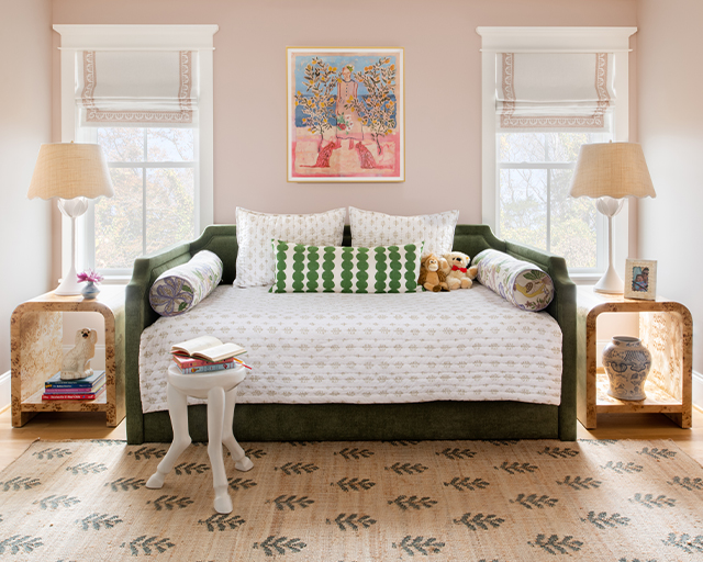
 Interior design by Glickman Studio. Photography by Michael J. Lee.
French Lilac by Benjamin Moore. “We used French Lilac on the walls of a kids room in the renovation of a gorgeous historic home, pulling the color into the window treatments and pairing the paint with a gold embellished star wallcovering on the ceiling. We’re currently using a similar shade on cabinetry in a laundry room, which is a great place to use a bolder color on cabinetry.”
Glickman Design Studio appears in The Scout Guide Charlottesville.
 Interior design by Dana Small Designs. Photography by Dana Small.
Dana Small, interior designer and owner of Matilda’s and Dana Small Designs in Stuart, Florida
Sapphire Ice by Benjamin Moore. “This is the perfect shade of blue. It’s fresh, bright, and actually quite neutral when it comes to pairing it with blue and white fabrics and wallcoverings. It is a happy medium between a periwinkle and robin’s egg. I have used it on exterior shutters, interior trim, ceiling, and doors in high gloss, as a kitchen island for contrast, and as a custom colorway in decorative wallpapers.”
 Interior design by Dana Small Designs. Photography by Dana Small.
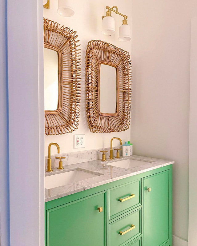
Cedar Green by Benjamin Moore. “I love green! Shocker because I am known for blue and white. Green is such a versatile color—it can be used everywhere from a child’s room to a guest bath. This shade is a very grounded green and not too reflective, therefore it will be a softer option in your desired space.”
Fruit Shake by Benjamin Moore. “A fabulous pink I only wish I had discovered sooner. It has a feminine flare and a tropical punch, and is the perfect background for a coordinating white and green palette.”
Matilda’s appears in The Scout Guide Jupiter & Palm Beach Gardens.
 Interior design by Alisa Cristine Interiors. Photography by Sarah Linden Photography.
Alisa Popelka, owner and principal interior designer of Alisa Cristine Interiors in Ann Arbor, Michigan and Dallas, Texas
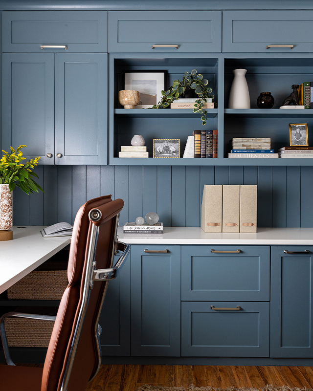
Labradorite by Sherwin Williams. “Labradorite is a smoky blue with soft, cool undertones that’s a timeless color to use in any room. It’s excellent for exteriors, doors, and cabinets (think mudroom or office) and it would make for a beautiful lacquered finish on millwork or a ceiling.”
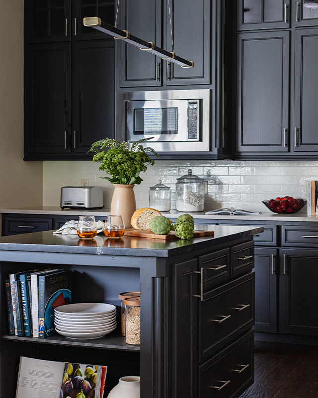 Interior design by Alisa Cristine Interiors. Photography by Becca Lea Photography.
Iron Ore by Sherwin Williams. “Iron Ore is a soft black that is versatile and can add sophistication and drama to exteriors, doors and cabinets. Iron Ore is the perfect color to use when a client wants a dark, moody color but can’t commit to black.”
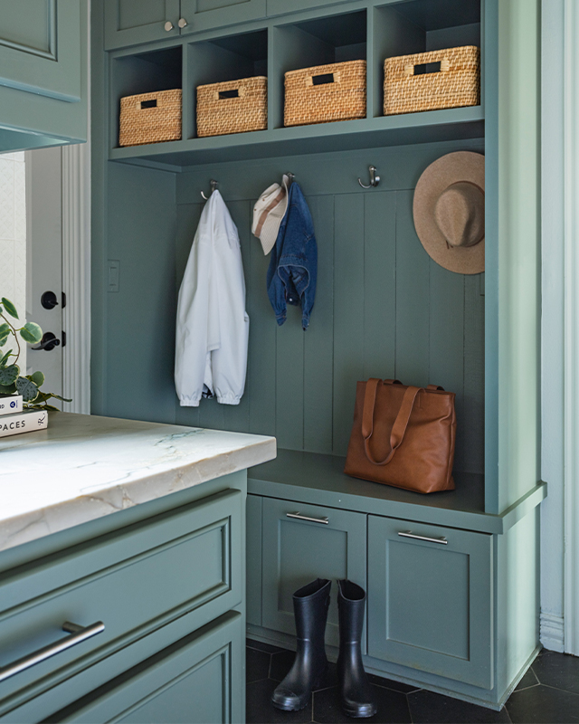 Interior design by Alisa Cristine Interiors. Photography by Becca Lea Photography.
Retreat by Sherwin Williams. “This peaceful and calming mid-toned green paint color can shift dramatically depending on the light exposure. From walls to cabinets, it’s a gorgeous paint color to bring the outdoors in with practicality and style.”
Alisa Cristine Interiors appears in The Scout Guide Ann Arbor.
 Interior design by Julie Cashman, Elizabeth Schnabel, & Jenny Schnabel. Photography by Caroline Allison.
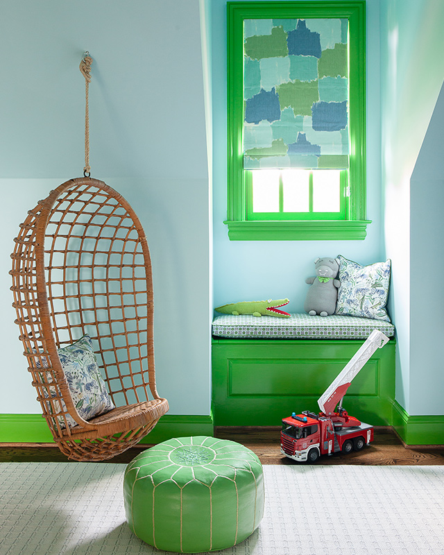
Margaret and Julie Cashman, owners of Cashman Interiors in Lexington, Kentucky
Basil Green by Benjamin Moore. “We designed this little boy’s room to be a bright space that inspires creativity and growth. This beautiful green elevates the trim and takes it from an overlooked element to a showstopping feature of this room design. This cheerful color pairs well with the soft blue Benjamin Moore Picture Perfect wall color.”
 Interior design by Julie Cashman, Elizabeth Schnabel, & Jenny Schnabel. Photography by Caroline Allison.
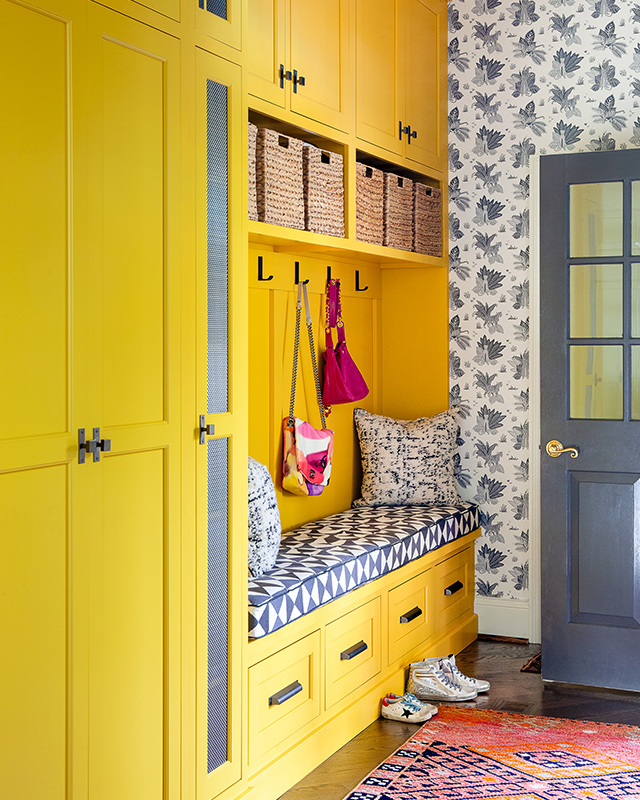
Yellow by Benjamin Moore. “Sunny, yellow cabinets in a back mud hall give what is typically a utilitarian space a bright and cheery makeover. A yellow that is bold and happy, while allowing the more neutral House of Harris wallpaper to also stand out in contrast.”
 Interior design by Julie Cashman, Elizabeth Schnabel, & Jenny Schnabel. Photography by Keni Parks Photography.
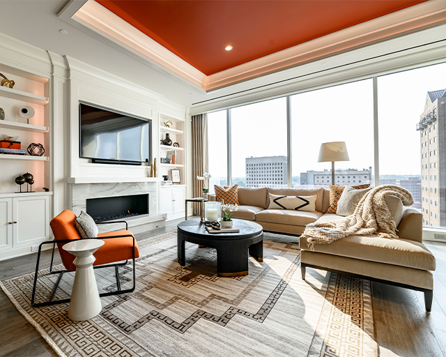
Copper Clay by Benjamin Moore. “This is a fabulous shade of orange that is bold but not overwhelming. When used on the ceiling, rather than the walls, it almost becomes neutral and gives a warmth to the space, while not being overly masculine or feminine.”
Cashman Interiors appears in The Scout Guide Lexington.


